
We are now ten days into the mobile-friendly algorithm rollout, and to be honest, the impact has been somewhat underwhelming. I’ve been tracking many websites across categories and countries as the algorithm rolled out and it has been interesting to how some verticals were impacted, while others experienced no change. I didn’t personally see any fluctuations until last Thursday, but then started to pick up more examples as time went on. I’ve documented several examples in my last post in case you want to check them out, and have been updating that post when I come across new examples.
As I mentioned above, there are still some categories that remain completely unaffected. For example, there are websites that aren’t mobile-friendly still ranking extremely well with no impact at all. Google’s Gary Illyes explained this morning that the rollout is complete, but that some urls have not been reindexed yet. That means those urls don’t have the new scores yet (so rankings could change when that’s completed). Although the impact seems light right now, it would be smart to give it a little more time before coming to any conclusions. I definitely plan to write a post with my analysis once enough time goes by, so stay tuned.
Checking Smartphone Rankings
Now that the mobile-friendly algorithm has rolled out, I have received a lot of questions from business owners about how to best check their mobile performance over time. For example, how to identify mobile rankings fluctuations, how to view trending for mobile search traffic, which tools can help track those changes, etc. I’ve decided to focus on smartphone rankings in this post.
Below, I have provided five ways you can identify and track changes to your mobile rankings over time. And to clarify, I am referring to smartphone rankings, and not tablet. Tablet rankings are not being impacted by the mobile friendly algorithm, which I know has confused some people. By using the steps below, you should be able to gauge the impact of the mobile-friendly algorithm on your website(s). Let’s jump in.
1. Search Analytics Reporting in Google Webmaster Tools
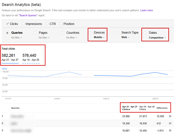
I have been testing the new Search Analytics reporting (now in beta) in Google Webmaster Tools since early March. It used to be called the “Search Impact” report, but that changed during the alpha. There is some outstanding functionality in the new search analytics reporting and I expect Google to roll it out soon to everyone. One reason I think they should roll it out is based on how you can track mobile versus desktop rankings. Using the Devices dimension, you can compare rankings across both desktop and mobile, which quickly enables you to identify a mobile rankings demotion.
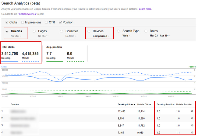
I already wrote a post explaining how to do this, and I highly l recommend you check out that post for more information. If you have access to the new reporting, then follow my tutorial and compare your rankings. If you don’t yet, then hang in there. Again, I expect it to roll out to everyone sooner than later. In a nutshell, you can view desktop and mobile rankings side by side. You can also compare timeframes for mobile rankings, and then compare mobile impressions and clicks to previous timeframes. Below, I’ve compared clicks after the mobile-friendly algorithm rolled out to prior.
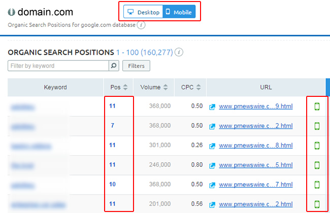
2. SEMrush Mobile Reporting (New!)
On 4/21 I fired up SEMrush to check the desktop rankings for a company I was analyzing when I noticed something very interesting. There was now a desktop/mobile toggle on the overview page. Clicking “mobile” brought up some very interesting mobile reports! It ends up SEMrush launched their new mobile reporting right on 4/21. Awesome.
On the overview page, you can view a graph showing the number of pages in the top 20 results from that domain that are mobile-friendly versus non mobile-friendly. It’s a great way to get a lay of the land. You can also view a search performance trend for mobile keywords, the top keywords from a mobile standpoint, and the position distribution for those keywords.
Then you can access the “Positions” report to view all keyword data for mobile, including rank. You can click the toggle up top to switch from mobile to desktop. And you can export the results to Excel where you can use vlookup to compare desktop and mobile rankings for each keyword. If you notice a significant discrepancy between the two, then you could be negatively (or positively) impacted by the mobile-friendly algorithm.
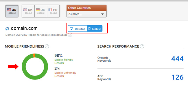
3. Searchmetrics Mobile Reporting
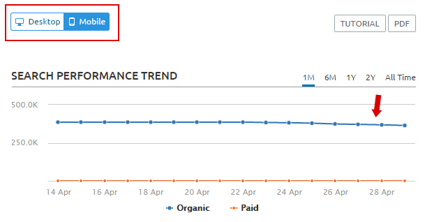
Searchmetrics also launched a mobile reporting beta. On the overview page for a domain, you can quickly view the search visibility across desktop and mobile.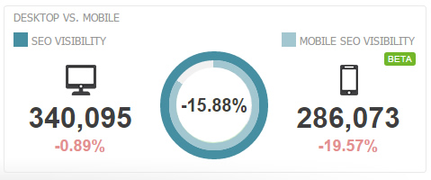
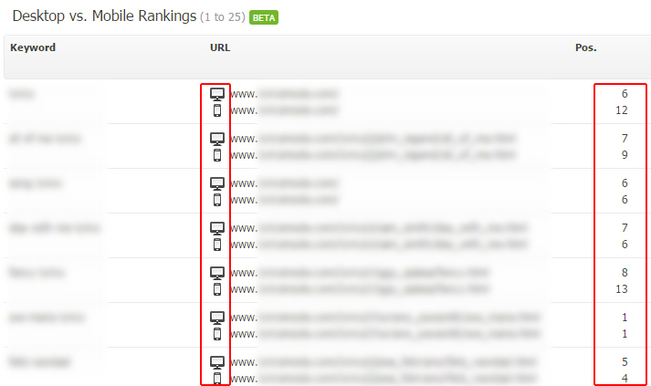
And clicking the “mobile” tab brings up a report showing both the desktop and mobile rankings for the keyword at hand. This clearly makes it easy to identify a mobile rankings demotion. You will see icons for desktop versus mobile for each keyword, along with the rank for each.
4. Manually Via Mobile Devices
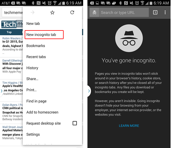
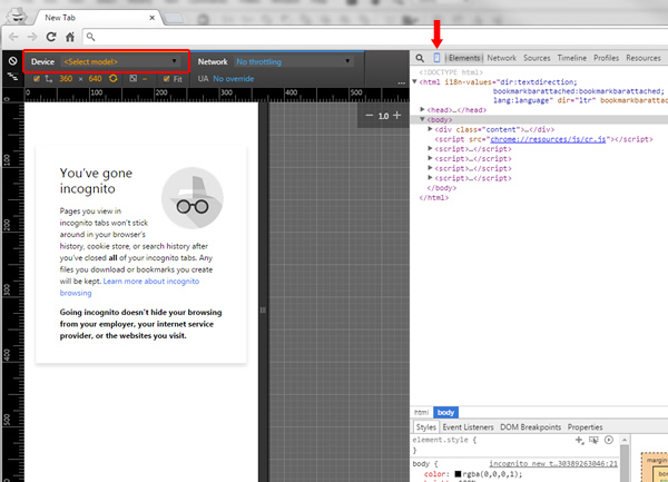
Yes, you can still check rankings manually via your mobile phone. For example, fire up Chrome on your mobile phone, go incognito, and test searches. Just keep in mind that your results can be impacted by your location. But you can easily turn off location services to see the difference when it’s on versus off. It’s not perfect, but can supplement other methods for checking mobile rankings.
Also, if you are checking sites targeting other countries, make sure to use the Google property for that country. For example, Google UK, Canada, Australia, etc. If not, you can obviously see different results. Again, not perfect, but can work. And definitely try and get your hands on multiple mobile devices. I have several I use to test sites during audits, including both Android and iOS devices.
5. Use Chrome Developer Tools To Emulate Mobile Devices
Many people still don’t realize that Chrome can do this… and it’s awesome. Right from Chrome developer tools, you can emulate any mobile device you want. This enables you to quickly check if a site is mobile-friendly or not. And as you have probably guessed by now, you can check Google rankings too.
Access Chrome Developer Tools by clicking the menu icon in Chrome, then Tools, and then Developer Tools. Or just click control->shift->i to bring up dev tools. Then click the icon for “Toggle Device Mode” (the mobile phone icon).
Once you do, you can choose the device you want to test and then refresh the page. Boom, you’re now emulating that device. You can see I’m emulating an iphone 6 in the screenshot below.
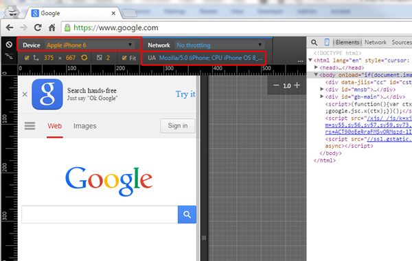
Also, when you hover your mouse over the screen, the cursor changes to a circle to signify tapping and swiping (like a person would do when using the device). Now access Google and search away. You will see the smartphone search results and you can check the rankings of target queries right from Chrome.
Summary – Check Mobile Rankings To Help Gauge *Your* Impact
Now that the mobile-friendly algorithm has rolled out, it’s important to check your mobile rankings for queries leading to your site. Using the methods listed above, you can quickly identify mobile rankings changes across keywords. And if you do find ranking differences, dig into the situation to find out why. Ensure all of your pages are mobile-friendly, implement any necessary fixes, and regain lost rankings.
Again, I plan to write a post detailing the impact of the mobile-friendly algorithm (once a little more time goes by). So stay tuned. :)
GG